REVIEW: MoMA looks at intersection of democracy, design, art
NEW YORK — The Museum of Modern Art’s soon-to-close exhibition This Is for Everyone: Design Experiments for the Common Good explores the idea of democracy and access in the design world. Bringing together objects from a variety of fields, the exhibition draws connections in how the public — all segments of it — needs to be considered throughout the design stage for everything from chairs to Internet symbols. “This is for Everyone” is a reference to a Twitter message from Tim Berners-Lee, inventor of the World Wide Web, the purported high point of democratized design.
Some of the objects on display will be completely new to visitors, especially in the realm of 3D printing and technologies for the home. Others, such as the symbol most computers display for “power,” are recognizable and made special with some context and historical notes.
Of the architectural offerings, the “Bone Chair” from Joris Laarman is quite interesting. It looks uncomfortable, sort of a metal office chair from the 1950s with no armrests and a starkness that doesn’t invite a good sit-down. However, the design apparently is contoured to the human body, with no extra space or part wasted.
Mathieu Lehanneur’s “Medicine by the Centimeter, from the Objets Thérapeutiques collection” is a novel approach to taking one’s medicine. Rather than placing the pills in a nondescript orange bottle, this medicinal centipede has small pods for each day’s pills, essentially giving the patient a clear visual of how much more of the treatment is needed. It’s a small object from 2001, but it fits perfectly into the exhibition’s goal of finding depth in the design elements of these everyday items. Lehanneur is also represented by “The First Mouthful, from the Objets Thérapeutiques collection,” another healthcare-related object that is meant to help dispense medicine, this time in between the prongs of a fork.
The “Botanica” series from Formafantasma, Andrea Trimarchi and Simone Farresin are some of the most “artistic” elements in the exhibition. These sculpted creations, using resin, wood fiber, shellac and ceramic, are molded around pitcher-like shapes and offer variations on what look to be common containers.
There are several electronic components on display as well, each an artistic creation and simultaneous useful bit of technology with a stated purpose. Several of the objects are meant to be utilized by laypeople, sidestepping the exclusivity of the academic and science worlds and enriching these objects with a DIY practicality.
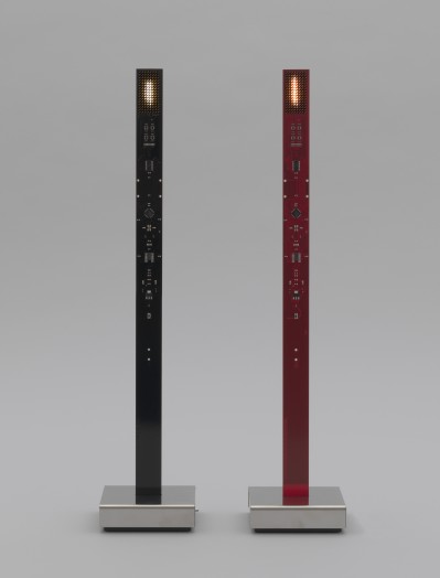
MoMA could have used some more helpful notes on the actual uses of the objects. A few of them, including “My New Flame,” simply hang there without much context. This pair of flickering, electronic flames appears to be a new way to gather warmth in the home, or it could be a purely aesthetic creation. There’s not much guidance on what “My New Flame” is designed for (a quick Google search fills in the blanks).
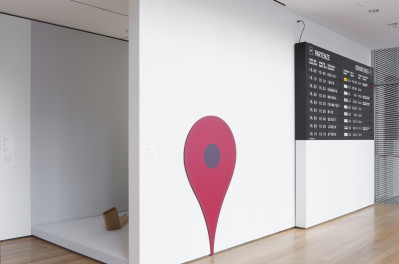
Around the bend from the main exhibition space are some interesting finds, including an “LGBT Flag” by Gilbert Baker, a “Google Maps Pin” by Jens Eilstrup Rasmussen and “Split Flap Board Flight Information Display System” by Solari di Udine, Italy. These objects are recognizable to many visitors, but they take on a newer meaning when their history is shared, their context is explained and their design is put on display from an artistic and societal point of view. That’s one of the strongest aspects of This Is for Everyone: Design Experiments for the Common Good; the out-of-this-world inventions, which are still based on practicality, are fascinating, but the backstories behind common objects and symbols make this is as much a modern history exhibition as a modern art one.
Robots by Anthony Dunne and Fiona Raby (Dunne & Raby) take up space in a small cubby; one wishes that MoMA would have turned them on for visitors’ enjoyment. Instead, there’s an accompanying video with some instruction on their different attributes and abilities.

Another highlight has to be the knot baskets from Benjamin Aranda and Chris Lasch (Aranda/Lasch), and Terrol Dew Johnson. These artistic creations look like baskets gone wrong, designs that became undone. However, after learning about their genesis, it becomes clear that these baskets, although not useful in typical basket form, are artistically rendered according to different considerations of their material (aluminum, branches, bear grass, sinew, styrene, wood veneer). The “Endless Knot” is the best looking of the three on display.
Geoffrey Mann’s “Attracted to Light From the Long Exposure series,” I believe, has been on display in MoMA before, in the very same gallery space, a few years ago. Thankfully they brought this wonderfully realized creation back. It’s a curvy, undulating lamp structure that looks like a dancer’s flowy dress is spinning on an axis. What actually is on display is the path of a moth as it circles a light source. Using technology to capture the movements, Mann was able to create what cannot be detected (or at least retained) by the human eye.
Among the several chairs, Patrick Jouin’s “C2 Solid Chair” and Marcel Wanders’ “Knotted Chair” are the most interesting, although they don’t look terribly comfortable. (It’s always frustrating to view furniture in a no-touch museum.)
The “Biowall” by Rachel Wingfield, Mathias Gmachl and Loop, PH takes some time to appreciate. It’s almost as if the designers have focused in on cellular structure, creating an interlocking series of fiberglass skeleton globes.
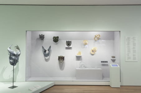
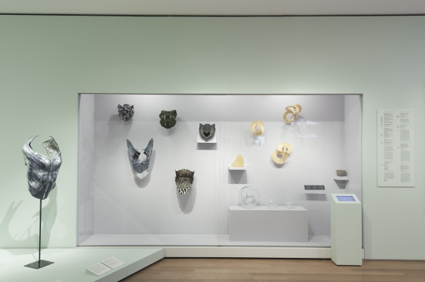
The 3D prints are something to behold. The objects from Neri Oxman, W. Craig Carter and Mediated Matter Group are scarily futuristic and based on folklore. Stare at them for a bit and familiar shapes/stories begin to emerge. Among the exhibits on display are “Imaginary Beings (Daphne),” “Imaginary Beings (Doppleganger),” “Imaginary Beings (Gravida),” “Imaginary Beings (Medusa 2),” “Imaginary Beings (Minotaur Head with Lamella” and “Imaginary Beings (Minotaur Head With Sutures).”
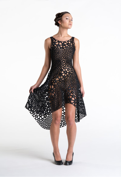
The first object viewers will see, and perhaps the most interesting of anything in This Is for Everyone: Design Experiments for the Common Good, is a 3D-designed dress called “Kinematics Dress” from Jessica Rosenkrantz and Jesse Louis-Rosenberg. The black-colored tessellations of this laser-sintered nylon are as intricate as snowflakes. View the dress from afar, and it looks like a shop window. View it from up close, and it’s as if a mathematical equation were stuck under a microscope.
Another interesting addition is the soy-sauce bottle from Kenji Ekuan and GK Design Group. “Kikkoman Soy Sauce Dispenser” is another object in the exhibition that is instantly familiar and yet, with a pause to enjoy its design, enters a new light of understanding. There are parallels between several of the pieces as well. Strange enough, the soy-sauce dispenser can find parallels with the “Google Maps Pin.” The pin is skinny at the bottom and wider on top, allowing Internet users to see the location on the actual map. The dispenser, certainly not offering directions, was designed in a sleek bottle that is also pinched at the top for easier use and elimination of the dripping effect.
If appreciating a “Google Maps Pin” is too commercial an exercise, check out “Free Universal Construction Kit” from Golan Levin, Shawn Sims, Sy-Lab and Free Art and Technology Lab. The display case with the kit features a variety of laser-sintered nylon pieces that allow players to use building blocks from several toy companies, Legos included. So the project essentially circumvents the commercial aspect of toy culture and makes all those plastic bits and pieces work in one seamless game. Take a look at the pieces, and guess which blocks go with which popular games.
When walking around the exhibit, which should take 60-90 minutes with much stopping, look for the many symbols. Visitors will find the stories behind the “Creative Commons License Symbol,” “Creative Commons NonCommercial Symbol” and the “@” symbol from Ray Tomlinson. The “@” symbol, in particular, has some fascinating cultural interpretations attached to its display.
Finishing the exhibition, around the corner and near the elevators, are several seminal video games, showcasing their unique design and evolution from one console to the next. Represented are “Pong,” “Pac-Man,” “Space Invaders,” “Minecraft” and “Tetris.” Nearby take a look for the artistic rendering of Wikipedia edits to the pages for “abortion” and “chocolate;’ it’s both a scientific and artistic look at society’s engagement with hot topics on the Internet.
This Is for Everyone: Design Experiments for the Common Good, which closes Monday, Jan. 18, is a celebration of democracy and accessibility through design elements both cutting-edge and familiar.
By John Soltes / Publisher / John@HollywoodSoapbox.com
- This Is for Everyone: Design Experiments for the Common Good is currently running at the Museum of Modern Art in Manhattan, N.Y. Click here for more information on tickets.

